A demo of the $t$-test
This one was for my daughter, who at the time was learning about the $t$-test.
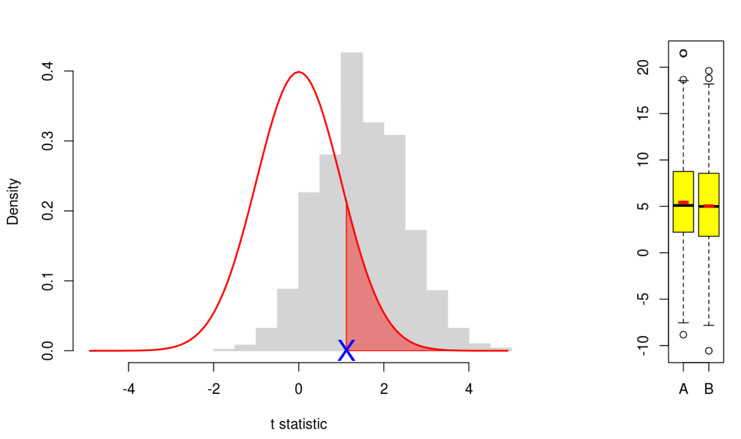
The demo linked above shows how the two-sample (Welch) $t$-test works. The idea is that there are two random variables (or populations) $A$ and $B$, each normally distributed, and we want to test whether these populations have the same mean. So we take a sample from each population. (Shown in the yellow boxplots. The red bar in the boxplot is the sample mean.)
Suppose these samples have size $n_A$, $n_B$ respectively, and that they have means $\overline{X}_A$, $\overline{X}_B$, and sample variances $s_A^2$, $s_B^2$. Let \[ t = \frac{\overline{X}_A - \overline{X}_B}{s} \] where \[ s = \sqrt{\frac{s_A^2}{n_A} + \frac{s_B^2}{n_B}}. \]
Then one can show that if the (unknown) population means are the same (that’s our null hypothesis) then the variable $t$, as we repeatedly draw samples, is distributed with a $t$-distribution.
This is what the main plot shows. For each experiment, a sample is drawn from each of $A$ and $B$, and the value of $t$ is marked as a blue cross on the horizontal axis. For comparison, the grey histogram shows how the blue cross would be distributed over 1000 such experiments. So you can see how typical the value of $t$ is for the given population parameters. The red curve is the $t$-distribution under our null hypothesis. So you can also see how typical the blue cross is with respect to this hypothesis. Note that, with the starting values of the population parameters, the means are equal, so the null hypothesis is met and the red curve matches well to the grey histogram. But explore what happens as the means are moved apart.
The red region in the tail of the $t$-distribution from our blue cross has area which equals the probability, under the null hypothesis, of finding this or a more extreme result. This is the $p$-value of the test.
To be precise, the red curve plots the $t$-density \[ f(x) = \frac{\Gamma {d+1 \choose 2}}{\sqrt{d \pi} \Gamma {d \choose 2}}\left( 1 + \frac{x^2}{d}\right)^{-\frac{d+1}{2}} \] where $d$ is a parameter called the number of degrees of freedom. If one does the maths to derive the distribution of the $t$-statistic under our null hypothesis, one finds a messy formula for $d$: \[ d = \frac{s^4}{\frac{(s_A^2 / n_A)^2}{n_A - 1} + \frac{(s_B^2 / n_B)^2}{n_B - 1}} \] So as the sample sizes increase, so does $d$, and the red curve $f(x)$ becomes more concentrated at 0.
At the bottom of the plot is the output of the R function t.test() for the given samples. It shows, in particular, the value of $t$ and the $p$-value. The demo tries to make this output intuitive — how does the $p$-value respond as we vary the population mean and variance, or the sample sizes?