Exploring a computer network from its netflow traffic I
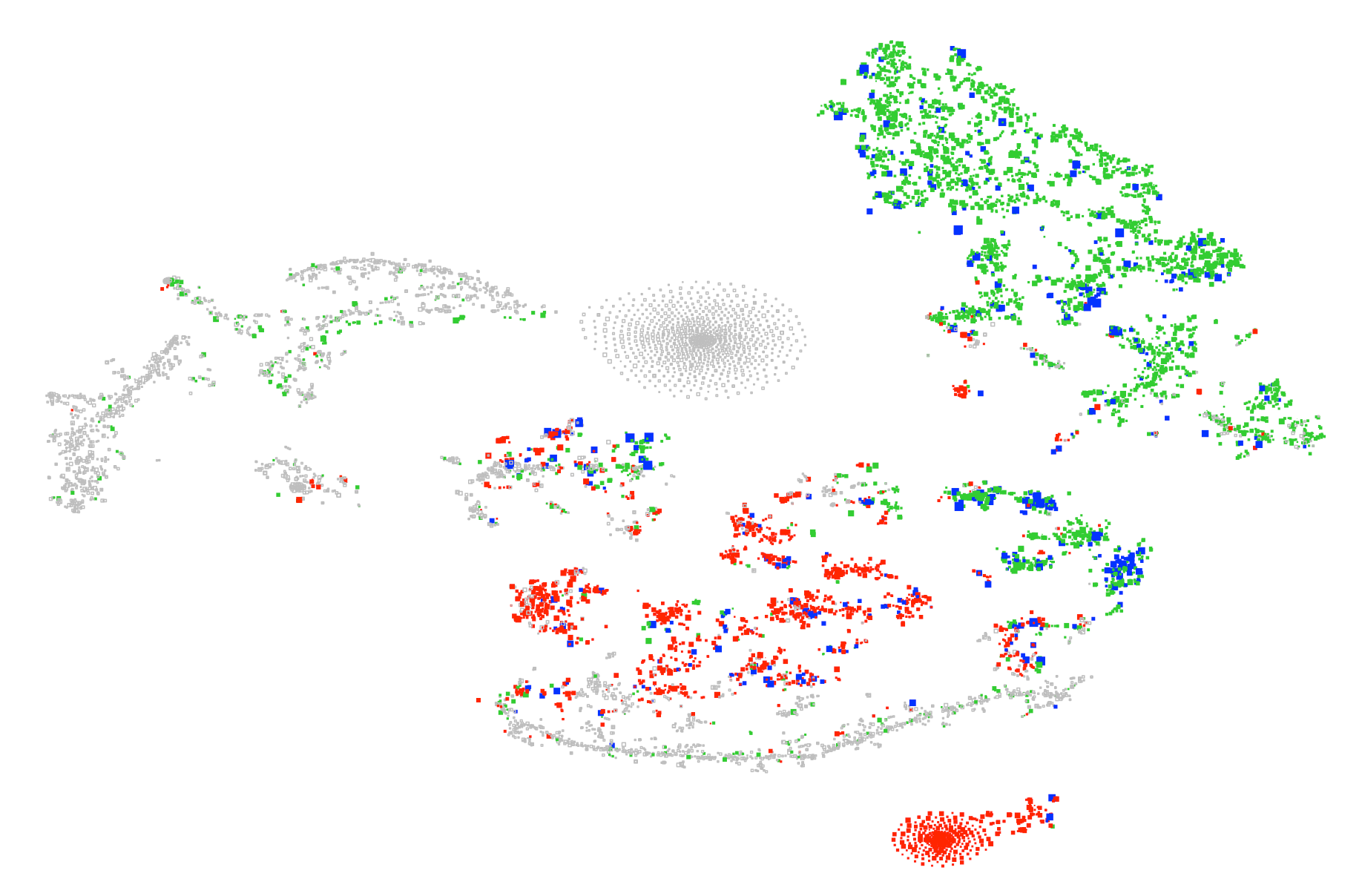
This blog takes a look at (part of) a data set released a few years ago by Los Alamos US National Labs [1]. There are five files in all, consisting of anonymised netflow, DNS records, authentication events, Windows process and red-team events on the lab’s internal network. In this first post I’m looking only at the netflow data flows.txt.gz. The plot above is a visualisation of the computers in the data set. On the basis of the netflow alone, how does one characterise and cluster the computers by their functional role in the network?
First of all, what’s in the data set? It contains 130 million flow records involving 12,027 distinct computers over 36 days (not the full 58 days claimed for the entire data release). Each record consists of: time (to nearest second), duration, source and destination computer ids, source and destination ports, protocol, number of packets and number of bytes. Protocol is one of 1 (ICMP), 6 (UDP), 17 (TCP) or 41 (associated with IPv6 tunneling, and much rarer than the others).
For this exercise, I’ve restricted to the 10,109 computers which are recorded in at least 100 flows for the period. The main plot is linked to the graphic above. It visualises this set of computers and is interactive (using R-shiny), allowing zooming and inspection of individual computers.
(You’ll see that there are actually two plots: a ‘functional view’ on the left, and a ‘communications view’ on the right. This post is about the first – we’ll discuss the second in the next blog.)
For this representation, I contructed for each computer a feature vector of length 6 x 136 + 6 x 4 = 840. Namely, I looked at 6 probability distributions over the 136 most popular destination ports (in the drop-down menu top left) or ‘other port’. The distributions were: port probability of an in-coming flow, byte or second-duration, respectively — or the same for an out-going flow. The remaining 6 x 4 numbers were the equivalent distributions over the 4 protocols.
I then used t-SNE (dimensional reduction) to project from this 840-dimensional representation down to the plane [2]. (More precisely, I used an implementation of the Barnes-Hut version of the algorithm [3], which gives a significant speed-up and, by allowing a many more iterations, brings out more structure in the data.) The idea is that proximity in the plane should correspond to similarity of port and protocol usage, and we should see how the computers of the network cluster by function.
You can zoom in on the main plot below to see a magnified view. In the magnified view you can inspect individual boxes by hovering or clicking, to show its actual protocol and port probabilities.
In both plots, the boxes are sized proportional to their ‘busyness’: log of the number of bytes exhcanged over the period (ranging from 244 kB to 26 TB).
The colour convention (when a port is selected, or in the probability plots) is that red denotes in-coming only (i.e. port is served on this box) and green denotes out-going only (i.e. port is queried from this box). Blue (when a port is selected) denotes both directions seen.
A good way to start exploring the plot is to highlight on port 80. Roughly, red will then show the web-servers and green the web-clients.
There are also amplifier (or ‘temperature’) controls: these serve to amplify the signal from ports and protocols with probability close to zero. At temperature T, what is shown is each probability raised to the power of 1/T.
References
- Alexander D. Kent: Comprehensive multi-source cyber-security events, doi:10.17021/1179829 (2015)
- Laurens van der Maaten, Geoffrey Hinton: Visualizing Data using t-SNE, Journal of Machine Learning Research, 1 (2008)
- Laurens van der Maaten: Barnes-Hut-SNE, arXiv:1301.3342v2 [cs.LG] (2013)