Exploring a computer network from its netflow traffic II
In the previous post I showed a visualisation of 10,000 computers as points in the plane, on the basis of their profiles of port and protocol usage. This second post has two motivations (and I hope they won’t trip over each other).
The first is unfinished business from the first post: I didn’t look at the communications graph. I visualised the functional profiles, but not which computers were talking to which others. The (linked) interactive demo tries to address this in its ‘functional view’.
My second motivation was to try out a recent graph layout method called LINE [5]. So let’s start by looking at a few different ways to lay out a graph in the plane. Then in the second part I’ll draw some conclusions on the LANL network.
Graph layouts
So what’s the graph we’re considering? It has directed edges among the 10,109 computers looked at in the previous post — that is, those exhibiting at least 100 flows in the LANL netflow data set [1]. An edge is drawn whenever flows have been seen between two computers, and weighted with the log of the byte count in that direction. This gives a total of 157,767 directed weighted edges.
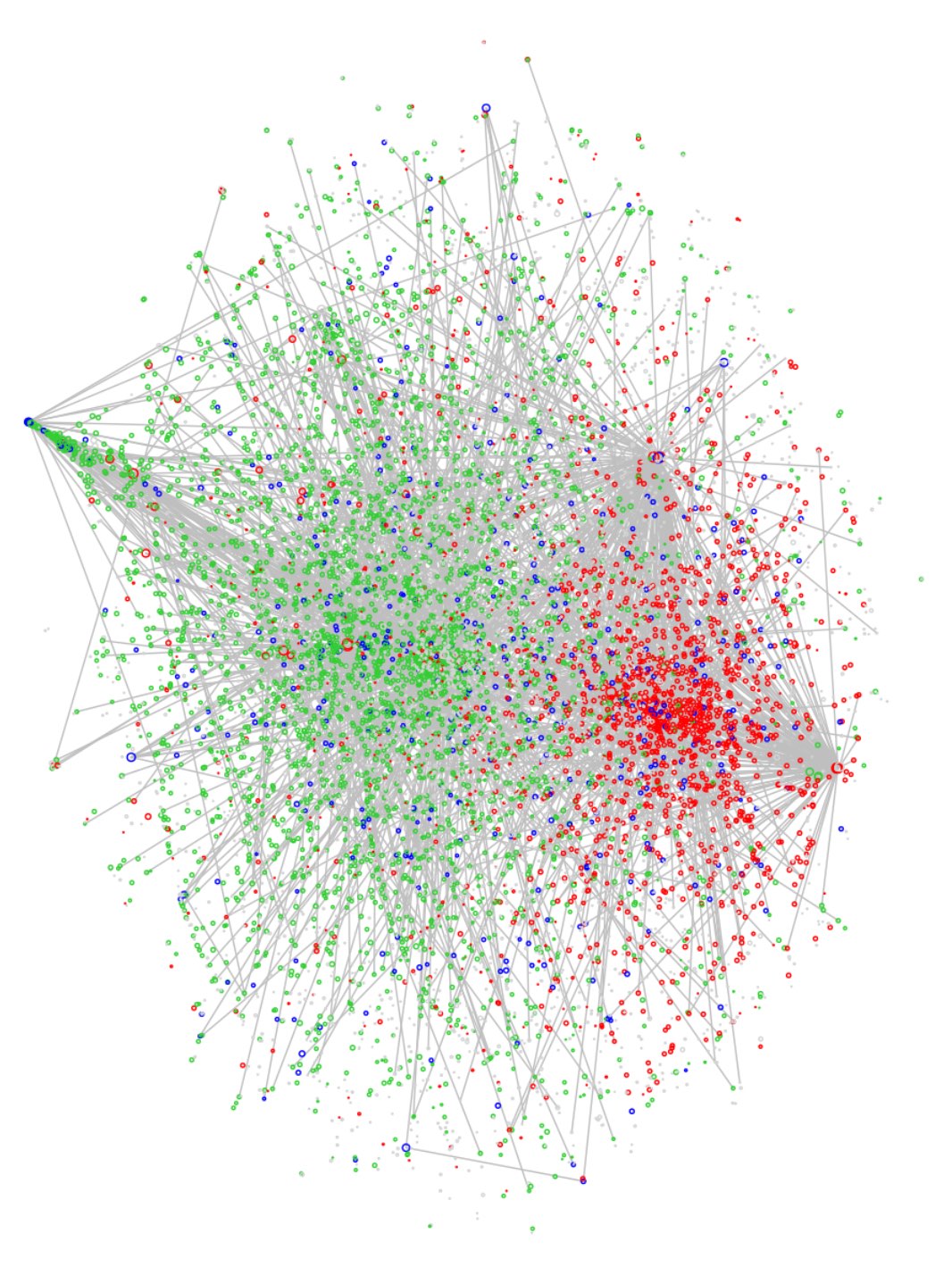
Let’s start with the basic workhorse of graph layout algorithms due to Fruchterman-Reingold (FR) [2]. This uses a heuristic ‘force-directed’ algorithm, with spring-like forces on the edges and a density-based repulsive force pushing all vertices apart:
To keep the plots manageable, I’m only showing up to 5% of the edges (though the layouts are computed using all edges). And I’ve coloured the vertices by their port 80 behaviour (green for sources, red for sinks, blue for both, grey for neither), as in the previous post. (You can change this in the interactive version.)
Do we see four clusters in this layout? Without the colours they’re not at all clear. (Try the interactive version below to judge for yourself.)
The plot at the top of this post shows the DRL layout [3,4] for the same graph, and this does much better in the sense that four high-level clusters are now clearly apparent. (I’ll offer an interpretation of these clusters in the next section.) DRL is actually the default method for a graph of this size using the igraph package (which is what I’ve used in R).
How does DRL improve on the FR algorithm? FR assigns vertex positions ${\bf x}_v \in {\mathbb R}^2$ that minimise a function
\[ \sum_{u,v} w_{uv} | {\bf x}_u - {\bf x}_v |^2 + \sum_u D(u), \]
where $D(u)$ is the density around vertex $u$ in the plane, and $w_{uv}$ are the edge weights. But this means that where edge weights are high, the first term dominates and the repulsive force due to $D(u)$ is ineffective. DRL gets round this by recursively removing long high-weight edges from the optimisation. This allows clusters to settle further apart in the plane — which is what we see in our example. (Those long end-to-end edges are the ones that will have been ‘cut’ during the optimisation.)
The moral here is that when visualising real-world graphs, the plotting algorithm matters. Our brains aren’t good at finding patterns in a thicket of edges and they need help. Structure that is present is easily missed if we don’t use the right layout method.
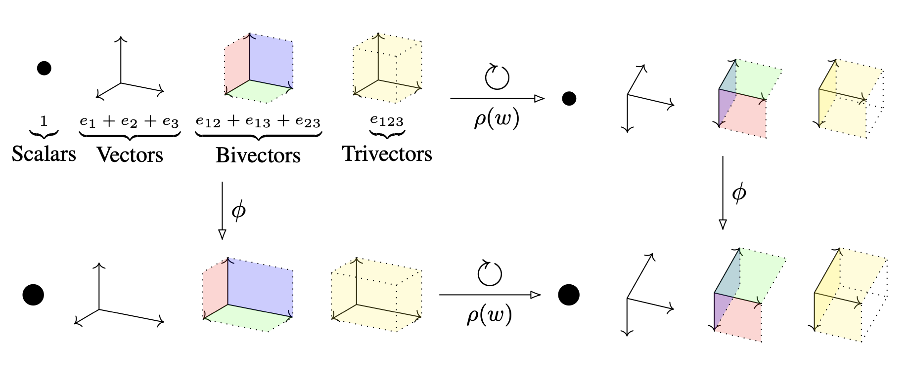
Now let’s take a look at the LINE algorithms [5]. I have some issues with the way this paper is written — with the definitions, for example, ranging from incomplete (Def 3) to redundant (Def 1,2). Nevertheless, there are some useful ideas and some usable software. Let’s start with the following diagram (Fig 1 in the paper):
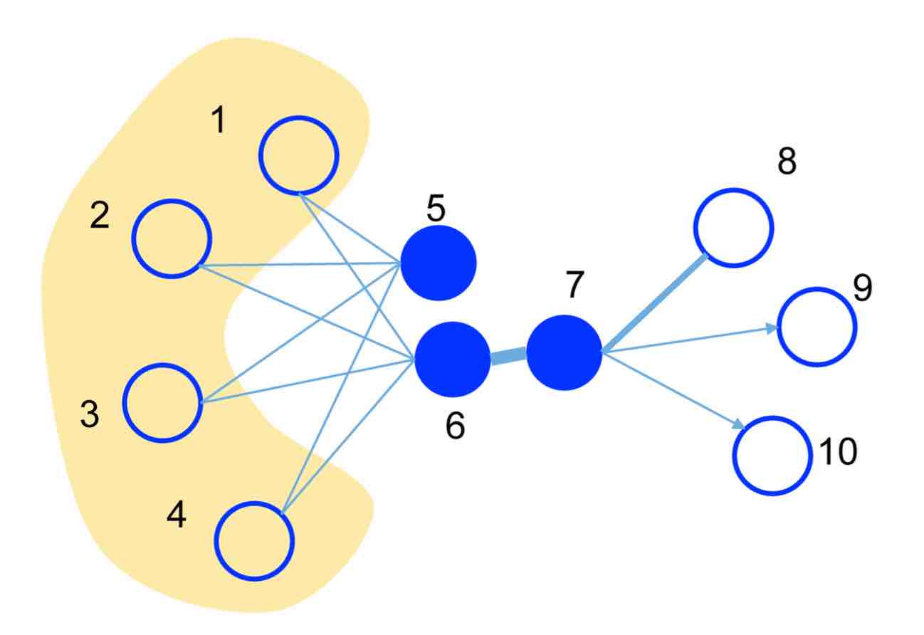
LINE concerns itself with two types of vertex proximity. ’1st-order proximity’ is simply the edge weight. So in this figure, vertices 6,7 are close in 1st-order while 5,6 are far apart. ’2nd-order proximity’ is measured by shared neighbours: so with this notion 5,6 are close while 6,7 are far apart. Laying the graph out by 2nd-order proximity will obviously give quite a different view from the more traditional 1st-order proximity.
Here’s how LINE 1st-order works. Vertices $v$ are mapped to vectors ${\bf x}_v \in {\mathbb R}^d$ in such way that the difference between two probability distributions is minimised. These distributions, over vertex pairs, are
\[ p_1(u,v) = \frac{1}{1 + e^{- { {\bf x}_u \cdot {\bf x}_v} }}, \]
\[ p_2(u,v) = \frac{w_{uv}}{W}, \]
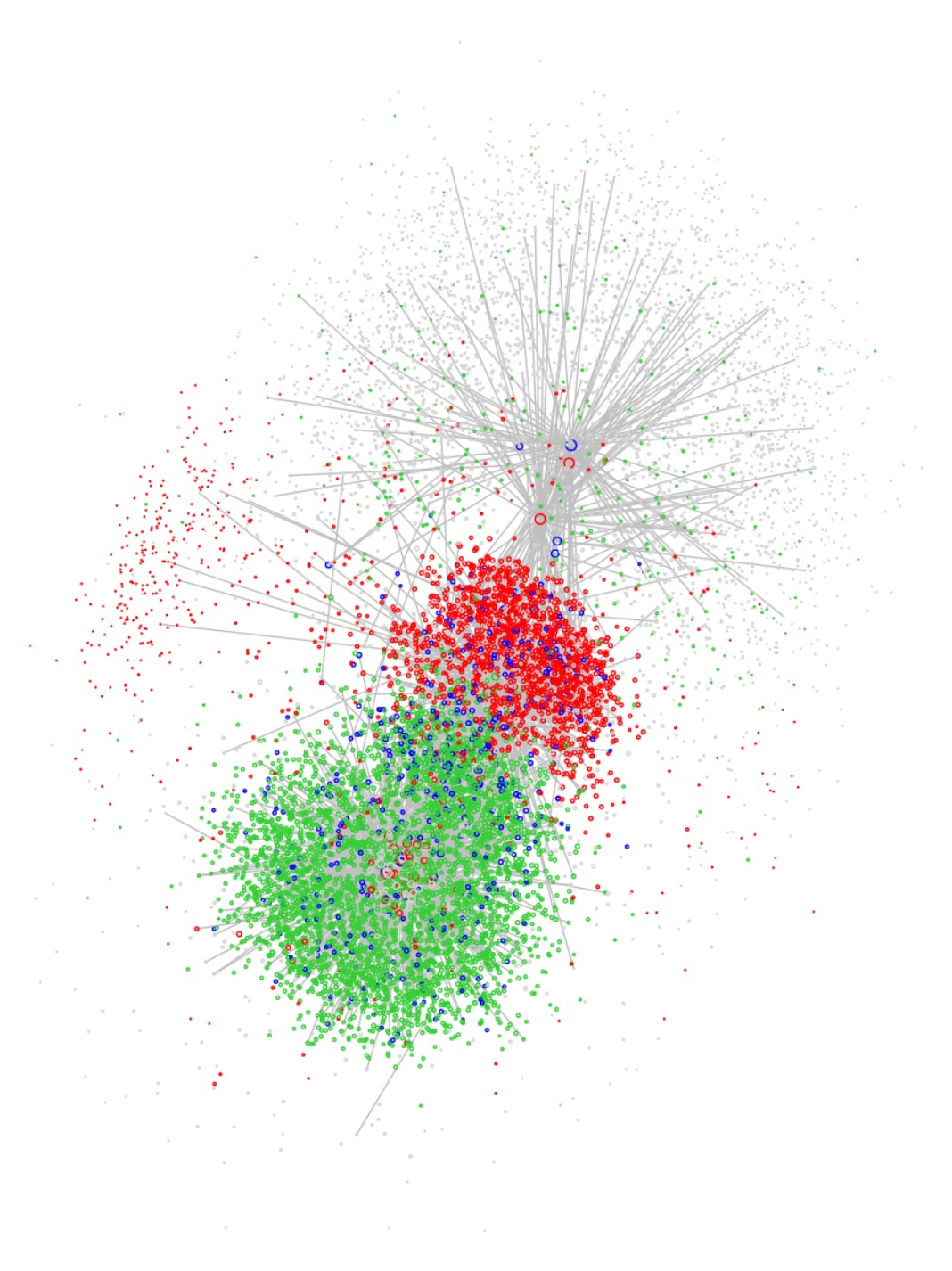
where $W$ is the total sum of edge weights $w_{uv}$. Minimising the KL-divergence between these two distributions has the effect of placing the graph in a layout that respects 1st-order proximity. Here’s the result on the netflow graph, using $d=100$ followed by a t-SNE dimensional reduction to the plane:
To my mind, this is less useful than either FR or DRL. Both FR and DRL actively penalise clusters getting too close, something that LINE ignores.
Here’s how LINE 2nd-order works. First, vertices $v$ are now mapped to pairs of vectors ${\bf x}_v, {\bf y}_v \in {\mathbb R}^d$. (Their notation is $\overrightarrow{u}_i$ and $\overrightarrow{u’}_i$.) Then they define probability distributions a bit like those above, but conditioned on a fixed vertex $v$:
\[ q_1(u \mid v) = \frac{ e^{ {\bf y}_u \cdot {\bf x}_v } }{ \sum_s e^{ {\bf y}_s \cdot {\bf x}_v } } \]
\[ q_2(u \mid v) = \frac{ w_{uv} }{ \sum_s w_{sv} } \]
In other words, minimising the difference between these two distributions has the effect of positioning the $x$-vectors to mirror the 2nd-order proximity of vertices $v$. LINE then uses the $x$-vectors for the graph layout. (But the $y$-vectors, although used in the software, are never output, and the LINE authors say no more about them. Another issue I have with the paper.)
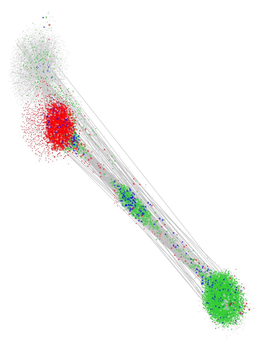
Again, here’s the result on the netflow graph — this time giving quite a novel view:
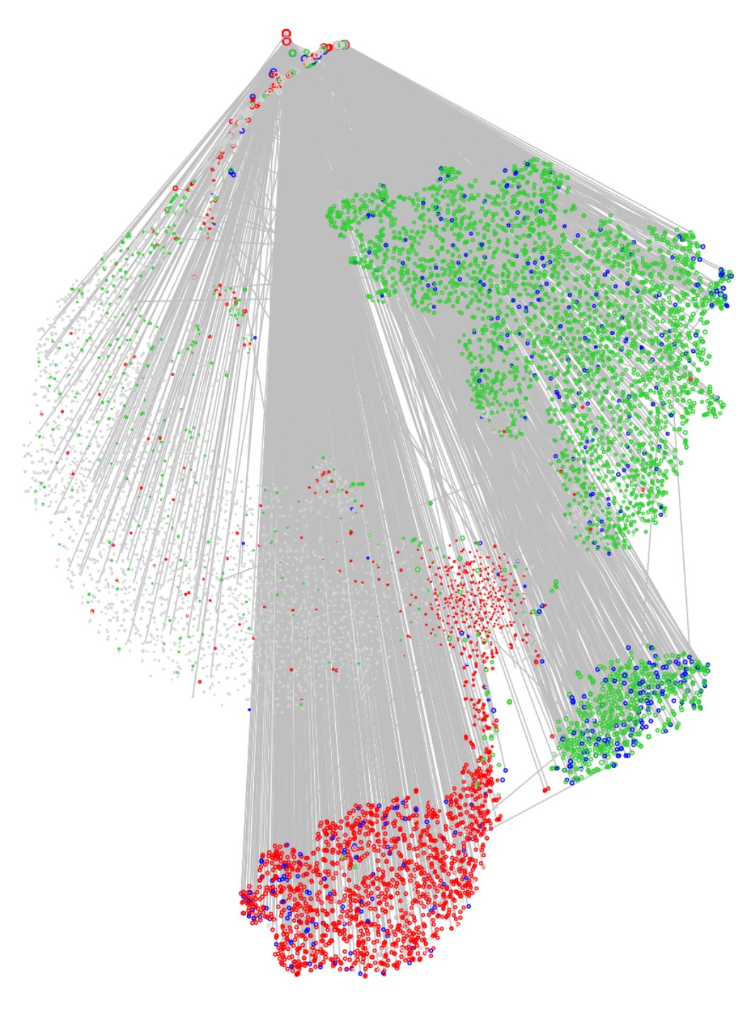
Clusters are now defined very much by commonality of communicants. In particular, the ‘head’ in this ‘angel’-like figure reveals a small number of high-degree computers that serve as proxies and mediate almost all of the network communications.
Let’s turn now to what all this reveals about the LANL network.
The LANL network
The interactive plots linked to the top of this post shows the functional and graph views side by side, with a few knobs and whistles to play with (note that selecting a region on one side will highlight the corresponding points on the other side).
Let’s start with the top-most of the four main clusters in the DRL view. This contains about 3,500 boxes and 13,000 edges. It includes the disk of 859 (port 445) servers in the top-centre of the functional view. It is strongly associated with ports such as 445 (Active Directory) and 137 (NetBIOS Name Service). This cluster appears to consist of servers with admin, security and access-control functions.
The second large cluster in the DRL view (blue for port 137, red for port 80) seems to consist of web and content servers. It is much denser than the first cluster, with around 2,300 boxes and 44,000 edges. It includes the disk of web servers at the bottom of the functional view. In fact, this disk consists of servers for which we see incoming flows to port 80 but no outgoing.
By selecting the web server disk (and its ‘comet’s tail’) in the functional view we see that it constitutes an outer shell in the DRL cluster. This cluster has a core which corresponds to the archipelago of boxes at the centre of the functional view, including for example email servers (port 25).
The cluster at the bottom of the DRL view, green for port 80, appears to contain the main population of client Windows machines (the north-east group in the functional view). The edge density is high — 67,000 edges for around 3,400 boxes — but almost all of these edges are to a small number of boxes in the centre of the functional view. When we select on the north-east functional group, we seen only 1,250 edges.
So the three large clusters in the DRL view appear to be roughly: security servers, web servers and Windows clients. What about the smaller, central cluster? This corresponds closely to the right-hand ‘foot’ in the 2nd-order LINE view. It is highly sparse, and contains proxy servers (head of the ‘angel’) as well as most boxes exhibiting outgoing (green) traffic to port 22 — that is, SSH users.
So is any of this useful? It offers a high-level map of the network, revealing at a coarse level the functions of the anonymised computers in the LANL data set based on their netflow behaviours. The visualisations above allow one to drill down further and examine individual network boxes. As remarked at the top of this post, the test of its usefulness should be to assist in modelling for substantive prediction of traffic and identification of anomalies.
References
- Alexander D. Kent: Comprehensive multi-source cyber-security events, doi:10.17021/1179829 (2015)
- Thomas M. J. Fruchterman, Edward M. Reingold: Graph drawing by force directed placement, Software Practice and Experience, Vol. 21, 1129–1164 (1991)
- S. Martin, W.M. Brown, R. Klavans, K.W. Boyack: DRL: Distributed Recursive (Graph) Layout<\a>, Sandia Reports 2936 1–10 (2008)
- S. Martin et al, Sandia NL: OpenOrd: An Open-Source Toolbox for Large Graph Layout, slides (2011) Jian Tang et al, Microsoft Asia: LINE: Large-scale Information Network Embedding, Proceedings of the 24th International Conference on World Wide Web, 1067–1077 (2015)