A topological trick for data visualisation
How do hand-written digits arrange themselves in pixel space?
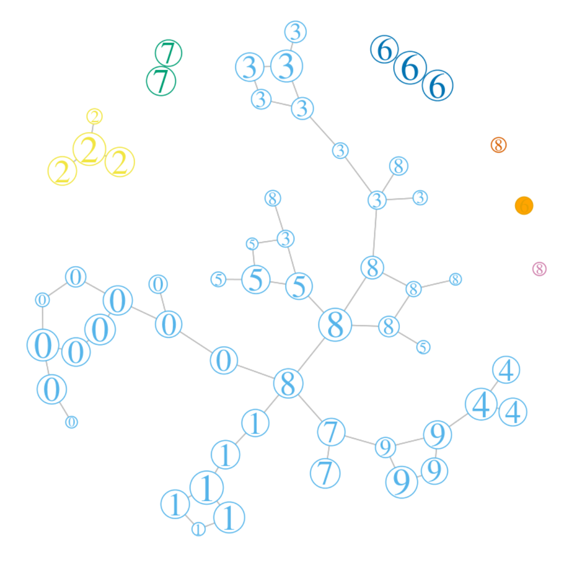
The visualisation above (and the interactive version linked to it) illustrates the mapper construction described by Gunnar Carlsson in [1] — here applied to the well known ‘Zip’ data set consisting of 7,291 hand-written digits (a relative of MNIST - this data set is described in more detail in [2]).
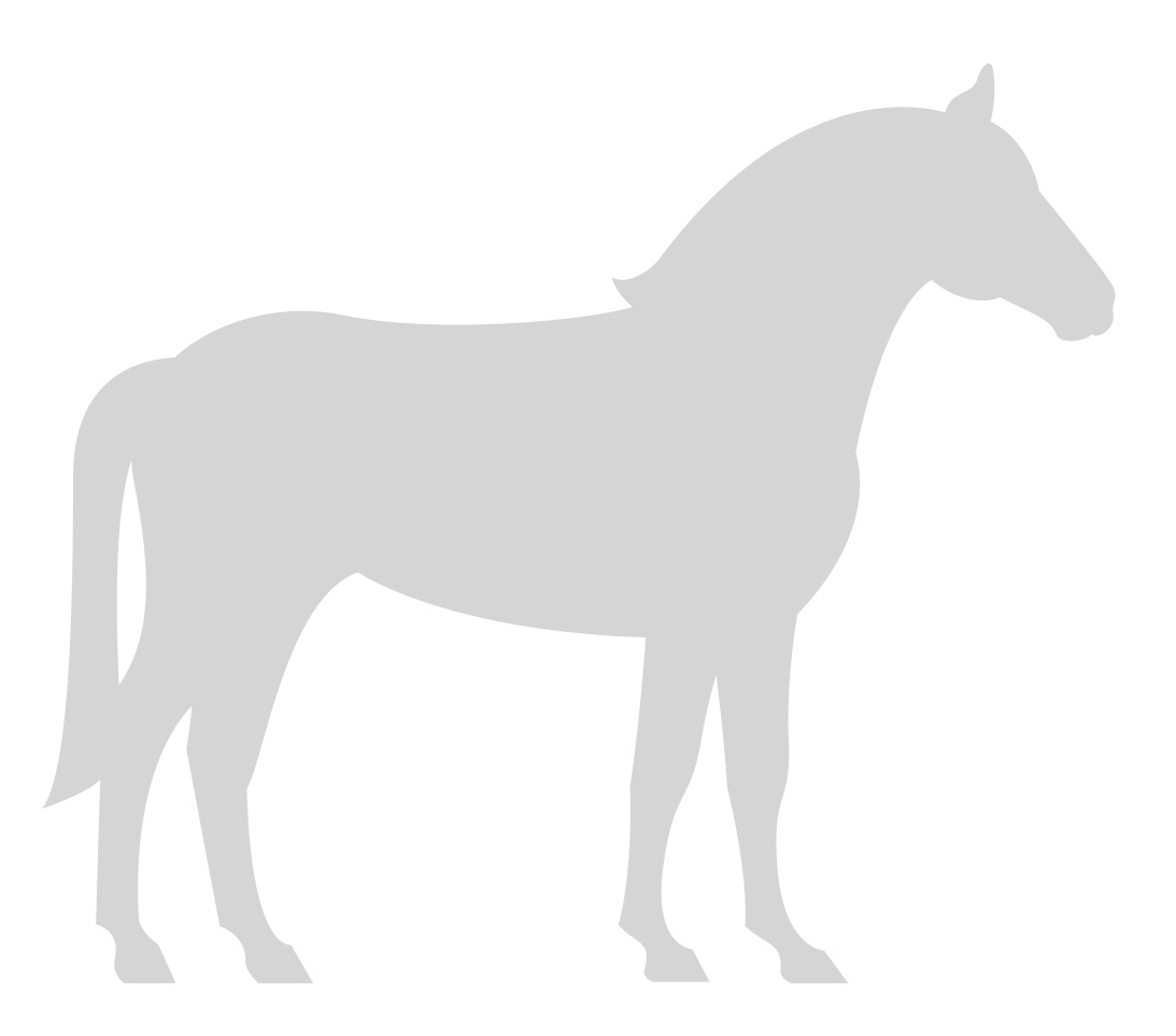
In order to understand the graphic above, I’d like to explain the key idea with an example. Let’s suppose we have a point cloud in some high-dimensional space – here imagined in grey:
We’d like to get a handle on its topological structure – that is, where the main lumps and holes and islands are. In dimensions higher than 2 or 3 these are hard to see directly. So suppose we have some convenient continuous scalar function on the point cloud (here imagined as height):
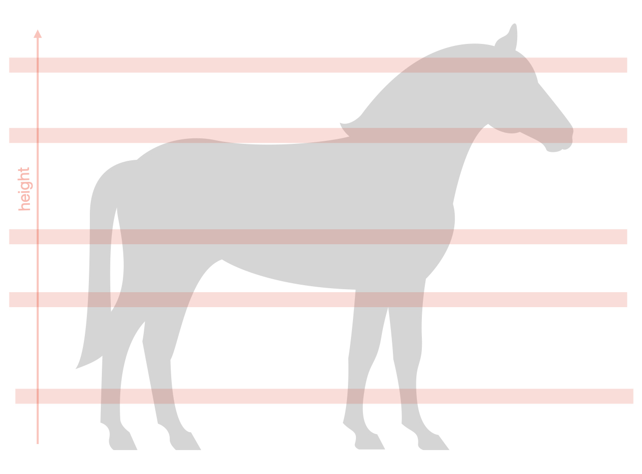
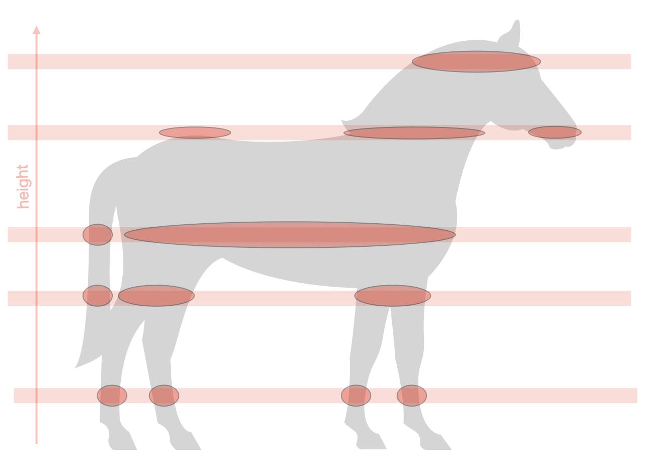
As this picture suggests, we can use the ‘height’ function to take broad slices through the point cloud. (More precisely, an open cover obtained by binning the height function.) Within each slice, we apply a clustering algorithm. As shown, these will typically give cleaner clusters than if we’d tried to cluster the whole point cloud.
Finally, treat each cluster as a ‘node’, and draw edges between clusters from different slices whenever they overlap. (To keep the graphic simple, the clusters above don’t overlap – but they would if I’d drawn a proper open covering of the point cloud by height bins.)
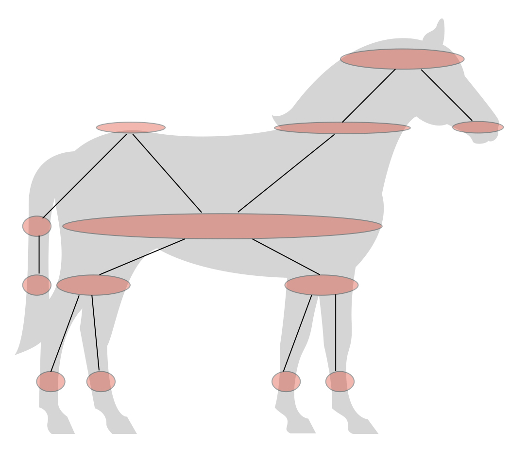
Having obtained a graph representation of the data set, we can draw it in the low dimensions and explore the structure of the point cloud. And that’s exactly what I’ve done with the Zip data set, which lives as a point cloud in 256-dimensional (8 x 8) pixel space.
What did I use for the ‘height’ function? Well, I used the local density of the point cloud — measured by counting neighbouring points within a fixed radius. (I’ll leave the reader to think about why that should be a continous function on the point cloud.)
You will note that there are two parameters that control the resolution of this graph: the number of ‘height’ bins and the number of clusters extracted within each bin. The interactive version of the Zip visualisation allows you to play with these to explore what works best. It also shows you (right-hand panel) an explicit sample of (up to 100) hand-written digits in a chosen node of the graph (remember that a node is a cluster within the point cloud).
How should you choose these tuning parameters? There is a trade-off between number of clusters (i.e. the number of graph vertices) and the amount of variation of digits within each cluster. You want both of these to be low.
(By the way, I’ve labelled each graph node with the majority digit in the corresponding cluster - but some of these clusters are ‘purer’ than others.)
Note that at the extremes: if the number of bins is 1 then the graph is totally disconnected, while if the number of clusters is set to 1 then the graph is a chain. Have fun!
References
- Gunnar Carlsson: Topology and Data, Bull. Amer. Math. Soc. 46 (2009)
- Trevor Hastie, Robert Tibshirani, Jerome Friedman: The Elements of Statistical Learning, Springer Series in Statistics (2001)

