Using topology to help visualise word vectors
Vector embeddings are at the heart of image and language models for AI applications including image captioning, machine translation, question-answering and many more. Vector representations of data arise as a natural by-product of neural networks via the states of their internal layers. Vector representations are also inherently geometric, and invite attempts at visualisation as a way to gain insight into data sets. In this post, I will illustrate this for one of the earliest and best known ‘neural’ vector embeddings.
word2vec [1] is a neural network-based algorithm for representing words of text by vectors, based on the contextual behaviour of those words in a given training corpus. This post is not about the algorithm — which I will take as given and just compute the vectors for a load of Wikipedia words. It’s about the question(s): given a cloud of 71,290 word2vec vectors in 200-dimensional space, can we make sense of this point cloud? What does it ‘look’ like, and how are the Wiki-words distributed within it? Can we interact with it visually?
The size of this point cloud makes this a good exercise, as it’s computationally expensive to apply a dimensional reduction such as t-SNE [2], and it’s not really feasible to try plotting so many points in the plane.
So I returned to the mapper construction from topological data analysis, as described in [3] and in my previous blog.
mapper says find a suitable open cover of the point cloud — one in which there’s good clustering within the sets of the cover. Then apply heirarchical clustering within each open set, and view all the resulting clusters as nodes of a graph, where edges are drawn between any two nodes for which the corresponding clusters have a point in common. What you end up with is a much smaller representation of the data, a graph, which is readily visualised and which summarises the distribution of all the points in the cloud.
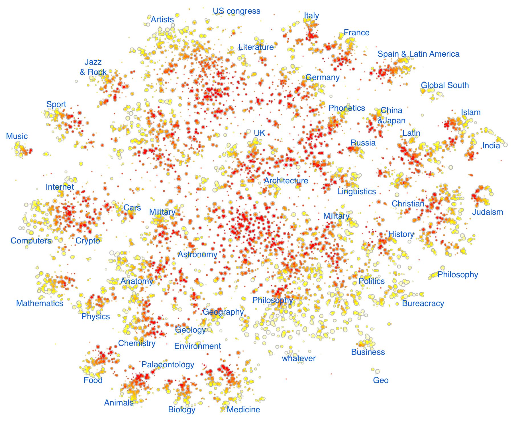
I’ll come back to the construction in a moment – but first take a look at the result here. We get a graph with 6,273 vertices (of which 4,797 form a giant component). You can select parts of the graph to zoom in on, and then scan the zoomed-in graph with the mouse to see what the word clusters are.
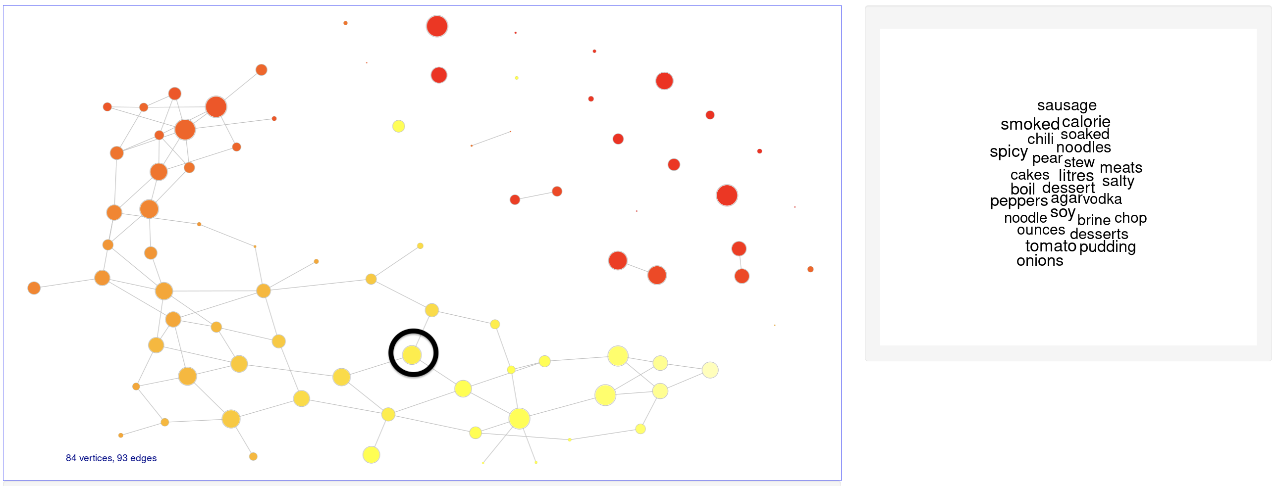
For example, try hovering over points (where ‘point’ = ‘cluster of words’) in the ‘foodie’ island:
(The demo has various other knobs and whistles (e.g. choices of graph layout, path-finding) – but I’m not concerned with those here. It is written using R shiny and igraph, as described in this blog.)
In the remainder of this post I want to explain the ‘topological’ part of the construction – that is, how I’ve applied mapper.
Following the description in my previous blog, we need a good covering of the point cloud by binning a suitable ‘height’ function. By ‘good’ we mean that geometric structures in the cloud should get ‘sliced’ and appear as islands in the sets of the covering. Think of a mountain range, with open sets given by altitude bands. As a whole, the mountains don’t cluster well because they’re all joined at sea level, but when you slice them at a given altitude they separate nicely.
The key observation is that word frequency, as a function on the point cloud, plays the role of altitude in this sense. In other words, the count of a word as it occurs in the Wikipedia corpus. As you’d expect, this has a power law distribution:
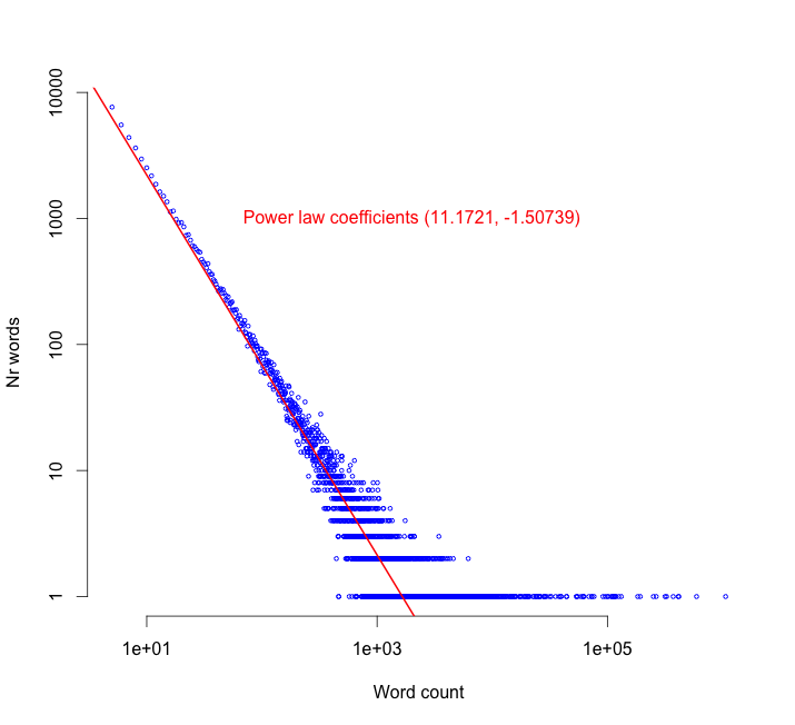
The uncommon words, like technical terms, obscure names, acronyms and so on, are in the top left while the more frequent, common-usage words are in the lower right of the plot. (And I’ll need those coefficients in just a moment.)
The intuition is that natural topics in text (mountains) always comprise a good range of word frequencies — they contain specialist words (coloured red in our graphics) as well as common-usage words (coloured white).
But to make use of word frequency, we need to know that it’s continuous as a function on the point cloud. I’ll justify this heuristically in the following way. First of all, here’s a histogram of point-to-point word2vec distances in a uniform sample of 1,000 words.
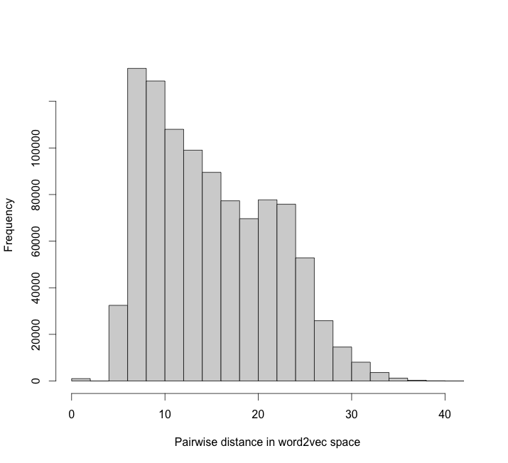
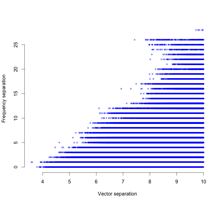
On the basis of this, let’s regard two points as ‘close’ if their distance is less than 10. For all point-pairs of distance less than 10, we can plot word2vec distance against frequency distance. It shows empirically that frequency is continuous – points close together always have frequency close together:
This is exactly what we need to apply mapper. I use word frequency as my ‘altitude’ function, where the bands are defined exponentially using those coefficients in the power law plot to ensure that all bands in the point cloud are of roughly equal size. Within each band I apply heirarchical clustering, and then edges form as clusters in one band overlap with clusters in an adjacent band.
Finally, having built the graph, we draw it in the plane.
A few extra technical remarks: since the vertices correspond to clusters of points in a vector space, we can represent them by the centroids of those clusters, and then map them into the plane by using a t-SNE projection of the centroids [2]. I suppressed drawing of the edges because they are often long-range and less helpful to the eye. (Though they are meaningful: they represent the many words which inhabit multiple semantic communities.) And colour denotes word frequency: white for common words to red for rare words.
References
- Google word2vec
- Laurens van der Maaten, Geoffrey Hinton: Visualizing Data using t-SNE, Journal of Machine Learning Research 1 (2008).
- Gunnar Carlsson: Topology and Data, Bull. Amer. Math. Soc. 46 (2009)